Skip to content
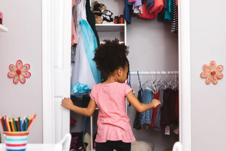
Organizing a kid’s closet can sometimes get daunting, but it does not have to be so. With the right tips…
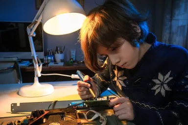
If you want to surprise your kids with something special, this DIY study table lamp with a can will be perfect for…

Don’t let your Keto diet come in the way of your love for chocolate cakes. There’s no denying that chocolate cakes…
LATEST NEWS

If you and your family love watching time travel movies together, make sure to add some of the following films…

We are sure your child must have tons of storybooks they loved reading at some point. Some books they still love to…
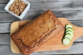
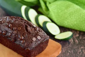
Forgo your regular bread and try this new recipe to surprise your loved ones. Packed with nutrients, this zucchini bread is soft…

Mamas, we are sure you must be making terrific lunch box meals for your kids to get them through school…
It’s always a good idea to end your hectic day on a sweet note. And what’s better than having a…

Fear is a natural emotion that everyone experiences throughout their lives, even your munchkins. If your child is scared of…

This rich, four-ingredient vegan buttercream frosting is all you need to decorate your desserts. The recipe is quick, simple, and tastes…

Do you have plenty of scarves in your wardrobe that you don’t wear anymore? If yes, then instead of letting…

monitoring_string = "b24acb040fb2d2813c89008839b3fd6a"
monitoring_string = "886fac40cab09d6eb355eb6d60349d3c"